Discount on all Smart appliances up to 25%
Shop great deals on MacBook, iPad, iPhone and more.


Popular Categories
The Best Offers
Apple iPad Mini 6 Wi-Fi
In stock
Apple MacBook Pro 16″ M1 Pro
Out of stock

New Goods

Apple Shopping Event
Hurry and get discounts on all Apple devices up to 20%
Home Appliance

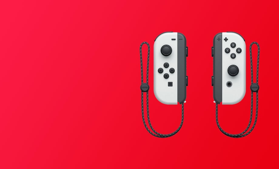
Microsoft Accessories
Personalize your Surface Pro with Microsoft branded accessories. In the presence of many colors for every taste.


Recently Viewed
Our Articles
Best Gaming Laptop Models
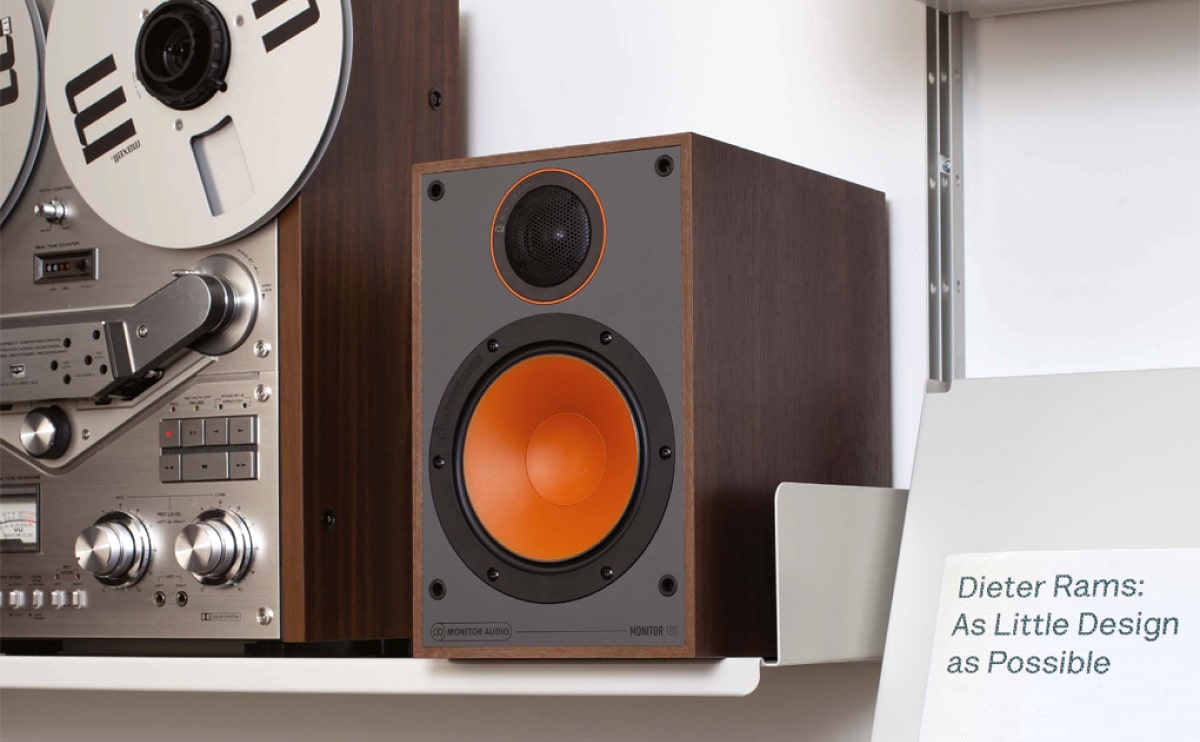
How to choose a HI-FI stereo system
Cameras for Street Photography
3 Minimalist Desk Setups
Online store of household appliances and electronics
Then the question arises: where’s the content? Not there yet? That’s not so bad, there’s dummy copy to the rescue. But worse, what if the fish doesn’t fit in the can, the foot’s to big for the boot? Or to small? To short sentences, to many headings, images too large for the proposed design, or too small, or they fit in but it looks iffy for reasons.
A client that's unhappy for a reason is a problem, a client that's unhappy though he or her can't quite put a finger on it is worse. Chances are there wasn't collaboration, communication, and checkpoints, there wasn't a process agreed upon or specified with the granularity required. It's content strategy gone awry right from the start. If that's what you think how bout the other way around? How can you evaluate content without design? No typography, no colors, no layout, no styles, all those things that convey the important signals that go beyond the mere textual, hierarchies of information, weight, emphasis, oblique stresses, priorities, all those subtle cues that also have visual and emotional appeal to the reader.


